


Description
Bright Addons for Gutenberg Blocks (formerly Bright Addons Blocks Library) adds 62 polished, ready-to-use blocks to the WordPress block editor (Gutenberg). Every block is set up from the sidebar – no code, no page builder, no extra framework.
Built by the team behind Bright Addons for Elementor, with the same clean design.
Header & Footer Builder
Design your site header and footer with blocks – logo, menu, buttons, contact details, social icons, anything – and choose exactly where each one shows:
- the entire site, the front page or the blog page,
- all posts, all pages or all items of any custom post type (products, events, portfolio…),
- post type archives, category, tag and custom taxonomy archives, search results, 404, author and date archives,
- single posts, pages, custom posts, categories, tags or terms you pick by name,
- with exceptions (“everywhere but the checkout page”).
When several fit a page, the most specific one wins. Mega menus are designed here too, then attached to a menu item in Appearance › Menus. Headers can scroll away, stay at the top, or hide while scrolling down and come back when scrolling up. Starter header and footer layouts get you going in one click. Works with block themes and classic themes.
Why Bright Addons Blocks
- Fast. Each block loads only its own small CSS file, and only on pages that use it. Scripts are tiny, plain JavaScript with no jQuery.
- Switch off what you don’t need. Turn any block on or off from Bright Blocks in your dashboard. Switched-off blocks don’t load at all.
- Accessible. Keyboard-friendly tabs, accordion and sliders, proper ARIA roles, visible focus styles and support for “reduce motion”.
- Works with your theme. Blocks follow your theme’s fonts and work with block themes and classic themes. Wide and full-width alignment is supported.
- SEO-friendly. Real headings you choose, clean markup and optional FAQ, Recipe and Event schema (JSON-LD).
- Live preview. What you see in the editor is exactly what visitors see.
- Entrance animations on every block. 40 animations, the full Elementor set and more: fading, zooming, bouncing, sliding, rotating, light speed, roll in, flip in and attention seekers (bounce, flash, pulse, rubber band, shake, head shake, swing, tada, wobble, jello), with duration and delay – set in the block sidebar, no code. Animations never change your layout or make the page scroll sideways, and visitors who prefer reduced motion see no animation.
- Translation ready and WPML compatible. Every text in the plugin can be translated, and a wpml-config.xml tells WPML which block settings hold text, so headings, buttons, list items, tabs, reviews and links of every block show up in the WPML Advanced Translation Editor. Headers, footers and mega menus from the Header & Footer Builder can be translated too.
The 62 blocks
Header, menu and forms
- Nav Menu – your WordPress menu with modern or simple dropdowns (hover or click), up to five levels, underline or pill hover styles, and mega menus you design with blocks (auto or full width). Below the breakpoint it turns into a slide-in panel or drop-down menu with accordions. Keyboard friendly, with Escape to close and focus kept in the panel.
- Form – a simple form builder: text, email, phone, number, URL, date, message, dropdown, radio buttons, checkboxes, consent and hidden fields, side-by-side widths, required fields, email notifications with Reply-To, saved entries under Bright Blocks › Form entries, success message or redirect, and built-in spam protection (honeypot, timing and rate limit). Works without JavaScript too.
Layout
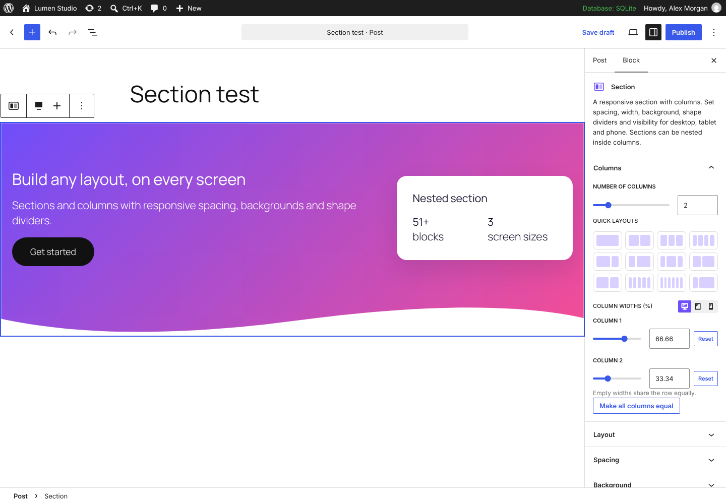
- Section & Columns – build any layout: 1 to 6 columns with quick layouts, nested sections, and padding, margin, gap, column width, minimum height and visibility set separately for desktop, tablet and phone. Color, gradient or image backgrounds with overlay and parallax, borders, rounded corners, shadows, 9 shape dividers, sticky columns, column order on small screens, entrance animations and equal height content: the last block in every column (a card, info box or pricing table) grows so the boxes line up.
- Flex / Grid Container – the modern way to lay out blocks, like containers in Elementor. Choose flexbox (direction, justify, align, wrap, equal width items) or CSS grid (1 to 12 columns, fill order, cell alignment), with gap, row gap, padding, margin and minimum height for desktop, tablet and phone. Theme, full or 100% width, nested containers, backgrounds with overlay, borders, shadows, visibility and entrance animations.
- One Page Scroller – dot, line or number navigation fixed to the side of the screen for one-page sites. It finds your sections by itself (or you choose them), shows where you are, scrolls smoothly with room for a sticky header, and can snap to sections.
Sliders
- Hero Slider – full-width hero slides with an image or a video background, pre-title, title, text and two buttons, overlay per slide, slide or fade transitions, Ken Burns motion on images, text animations, autoplay, arrows, dots, swipe and keyboard support. Only the visible slide’s video plays, and videos can be swapped for the poster image on phones.
- Image Slider – an image slider with motion effects (zoom in, zoom out, pan in every direction or random), slide or fade, captions on the image or below it, aspect ratio, links, autoplay, arrows, dots and swipe.
Content
- Advanced Heading – pre-title, highlighted phrase (gradient, color, underline or marker), separator and subtitle.
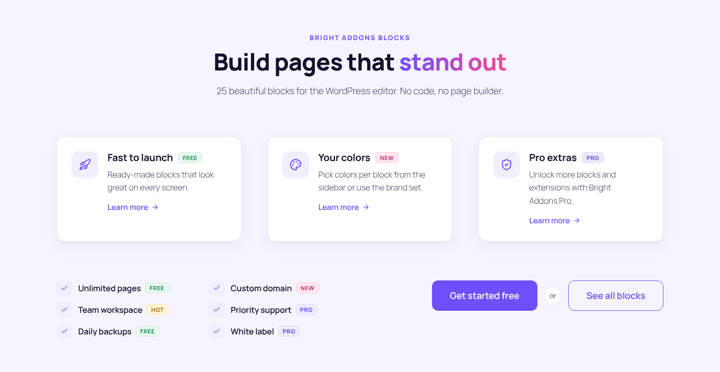
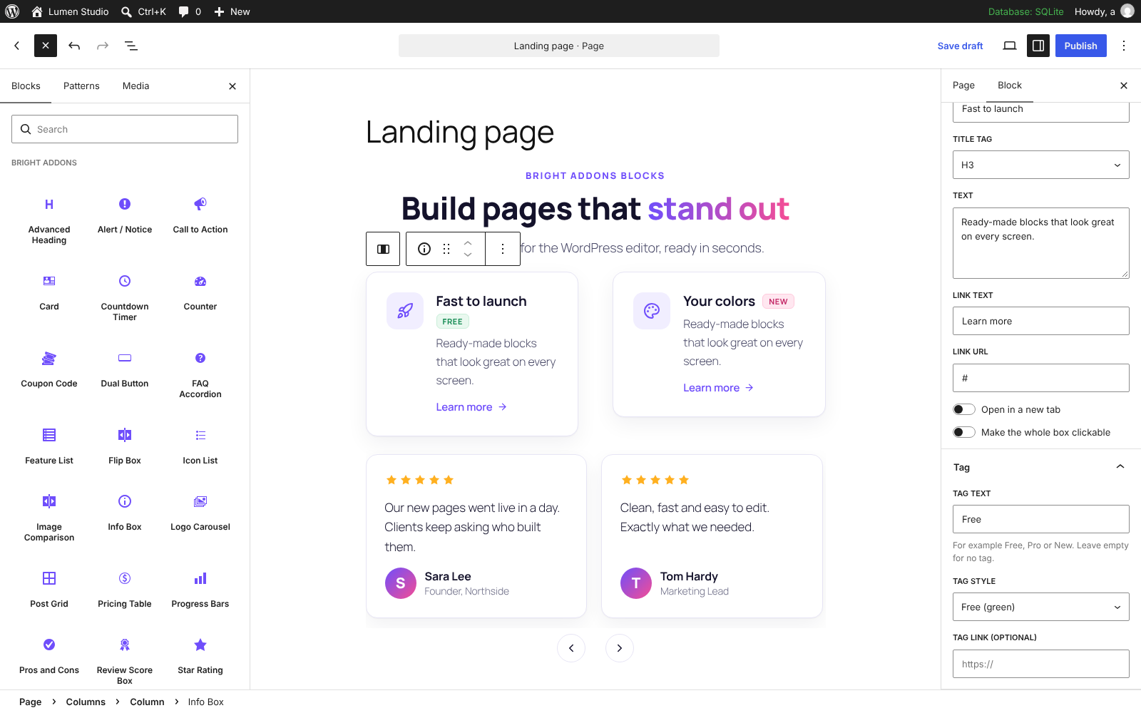
- Info Box – icon, title with an optional Free/Pro/New tag, text and link. Make the whole box clickable.
- Icon List – icons, links and Free/Pro/New/Hot tags before or after the text; stacked, multi-column or inline.
- Feature List – features with icons and a connector line.
- Card – image card with badge, title, text and a link.
- Flip Box – a card that flips on hover, focus or tap.
- Content Switcher – a toggle switch (like Monthly / Yearly), pills, buttons or underline tabs that switch between contents. Each content is rich text or a synced pattern, so you can switch whole pricing tables, feature lists or anything you build with blocks.
- Timeline – milestones, history or steps on a vertical timeline (alternating sides or one side) or as a horizontal carousel, with dates, icons, numbers or dots, images, rich text and a reveal while scrolling.
- Lottie Animation – lightweight Lottie animations from an uploaded .json file or a link, played on load, in view, on hover, on click or with the page scroll, with loop, speed, reverse and a link. A sample animation is included.
- Advanced Tabs – horizontal or vertical tabs in three styles, an icon on every tab (left, top or right) and a visual editor for the tab content: headings, lists, links, bold and more.
- FAQ Accordion – native, lightweight accordion with optional FAQ schema.
- Alert / Notice – info, success, warning and error messages that visitors can close.
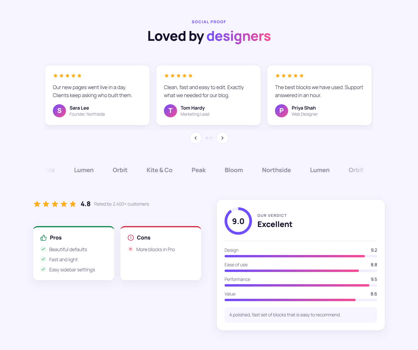
- Pros and Cons – two lists side by side.
- Tag Icon Box – icon box with a Free/Pro/New/Hot or custom-colour tag before, after or above the title.
- Advanced Divider – lines in several styles with text, an icon or both in the middle.
- Blockquote – five quote styles with drop cap, author photo, role and source link.
- Code Block – syntax highlighting for 25 languages, line numbers, highlighted lines, file name and a copy button.
- Simple Table – type rows with | between cells; striped, bordered, and stacked cards on phones.
- Recipe Card – times, servings, ingredients you can tick off, steps with photos, print button and Recipe schema.
Numbers and ratings
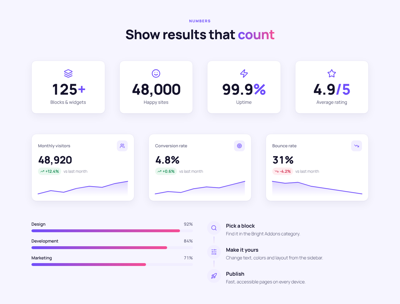
- Counter – counts up when it scrolls into view.
- Progress Bars – animated bars for skills or goals.
- Stat Card – a key number with its change and a small trend chart.
- Star Rating – half stars, score and label.
- Review Score Box – overall score ring, rating bars per category and a verdict.
Marketing
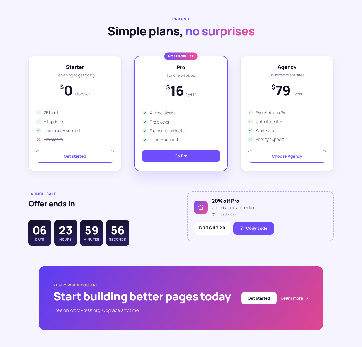
- Call to Action – headline, text and buttons on a gradient, dark or light background.
- Dual Button – two buttons with an optional “or” connector.
- Pricing Table – plan, price, features and a featured badge.
- Countdown Timer – for launches, sales and events (uses your site time zone).
- Coupon Code – a discount code with one-click copy.
- Testimonial Carousel – swipeable reviews with arrows, dots and autoplay. Long reviews can show only the first words (for example 150) with “See more” and “See less”, while every card keeps the same height.
- Logo Carousel – an endless, smooth logo marquee.
- Floating Contact – WhatsApp, phone, email, Messenger and Telegram buttons fixed to a corner of the screen.
- QR Code – for links, text, email, phone, SMS or Wi-Fi, with dot styles, colours, logo and download.
- Event Card – upcoming events with dates in your time zone, past events hidden automatically and Event schema.
- Job Listing – open positions with team, location and type filters.
Site and contact
- Site Logo – your site logo or title with tagline, linked home.
- Copyright – © year range, site name and footer links that update themselves.
- Contact Info – phone, email, address, hours and more, linked automatically.
- Social Icons – profile links or share buttons for 14 networks plus email in brand, outline or custom colours.
- Ajax Search – live search results as you type, with keyboard support; works as a normal search form without JavaScript.
Forms (shown when the form plugin is active)
- Contact Form 7 Styler, WPForms Styler, Gravity Forms Styler and Fluent Forms Styler – pick a form and give it outlined, filled or underline fields, your colours, rounded corners and a full-width button.
People, media and posts
- Team Member – photo, name, role, bio and social links.
- Image Comparison – a before/after slider that works with mouse, touch and keyboard.
- Post Grid – posts, pages or any custom post type (products, projects, events…) in five layouts: card, overlay, side image, minimal and featured. Filter by categories, tags or any custom taxonomy, choose the order, skip posts and leave out the post being viewed.
- Post Carousel – the same posts and custom post types in a swipeable carousel with card, overlay, side image or minimal layouts, items per view for desktop, tablet and phone, arrows, dots, loop and autoplay.
- Recent Posts – a compact list with thumbnails or numbers for sidebars and footers.
- Post Info – date, author, categories, comments and reading time for the current post.
- Image Gallery – grid, masonry or carousel layout, filter buttons that sort the images into groups, captions, hover effects and a keyboard-friendly lightbox.
- Image Mask – images in blob, arch, hexagon and other shapes, with a shape behind and gentle motion.
- Image Stack – layered images and floating info cards for hero sections.
- SVG Draw – line drawings that draw themselves in on scroll, load or hover.
- PDF Viewer – show a PDF on the page with download and open buttons.
Bright Addons Pro
Want more? Bright Addons Pro adds more blocks, Elementor widgets and extensions under one licence. This free plugin is complete on its own – nothing in it is locked.
Credits
- Outline icons from Lucide – ISC License.
- Lottie player lottie-web 5.12.2 (light build) – MIT License, © Airbnb. Unminified source in assets/vendor/lottie/lottie_light.js.
- Brand icons from Simple Icons – CC0 1.0.
- Syntax highlighting in the Code Block by Prism 1.30.0 – MIT License, © Lea Verou. Unminified source in blocks/code-block/prism.js.
- QR codes by qrcode-generator 2.0.4 – MIT License, © Kazuhiko Arase. Source in blocks/qr-code/qrcode-generator.js. “QR Code” is a registered trademark of DENSO WAVE INCORPORATED.
Installation
- In your dashboard go to Plugins › Add New, search for Bright Addons for Gutenberg Blocks and click Install Now, then Activate.
- Open any post or page in the block editor and click the + inserter. You’ll find all blocks in the Bright Addons category.
- Optional: go to Bright Blocks in the dashboard menu to switch off blocks you don’t use.
FAQ
Do I need Elementor?
No. This plugin is for the WordPress block editor. If you use Elementor, see our separate plugin, Bright Addons for Elementor.
Will it slow down my site?
No. Each block loads its own small stylesheet and script only on pages where that block is used. There are no external requests, no jQuery and no icon fonts – icons are inline SVG.
Does it work with my theme?
Yes. The blocks inherit your theme’s fonts and work with block themes (Twenty Twenty-Five, etc.) and classic themes.
How do I change colors?
Select the block and open the Colors panel in the block sidebar. Every block uses the brand colors by default and you can pick your own.
Is the plugin translation ready and WPML compatible?
Yes. All texts of the plugin are translation ready (text domain bright-addons-blocks-library), and the included wpml-config.xml tells WPML which block settings hold text, so you can translate the content of every block in the WPML Advanced Translation Editor. Polylang and other multilingual plugins work with the translated pages as usual.
How do I add an entrance animation?
Select any block and open “Entrance animation” in the sidebar (for Section and Column it is in their own settings). Choose one of the 40 animations, then the duration and delay. It plays once when the block scrolls into view, and never changes your layout.
Does the FAQ block add schema?
Yes, it can output FAQPage schema (JSON-LD) for search engines. Switch it off in the block settings if you don’t want it.
Which time zone does the countdown use?
Your site time zone from Settings › General. The Event Card uses it too.
How do the responsive settings work?
Settings with a desktop, tablet and phone switch (padding, gap, column widths, minimum height, corner radius) can have a different value per screen size. Switching the screen in the block settings also switches the editor preview. A tablet or phone value left empty uses the value of the next larger screen. Tablet is 1024px wide and below, phone 767px and below.
How do I make a section full width?
Select the Section and open Layout. Full width stretches the background to both edges of the window on any theme, even when the theme wraps the content in a narrow container, and keeps the columns in a centered box. 100% width lets the columns run edge to edge too. Theme width keeps the section inside your theme’s content area.
Does the Header & Footer Builder work with my theme?
Yes. With block themes it replaces the header and footer template parts; with classic themes it replaces the theme’s header and footer. Go to Bright Blocks › Header & Footer, add a header or footer, and choose where it shows in the Header & Footer settings panel. Pages without a matching template keep your theme’s own header and footer.
How do I add a mega menu?
- Go to Bright Blocks › Header & Footer, click Add a mega menu and design it with any blocks (or start from the ready-made layout). Publish it.
- Go to Appearance › Menus, open a top-level menu item and choose the mega menu under Mega menu. Pick auto or full width and save the menu.
- Add the Nav Menu block to your header and choose that menu.
Block themes get the Appearance › Menus screen as soon as this plugin is active.
Where do form submissions go?
They are emailed to the address you set in the Form block (or the site admin email) and saved under Bright Blocks › Form entries, unless you switch either off. Need multi-step forms, conditional logic or file uploads? The advanced Form Builder is coming to Bright Addons Pro.
What is the difference between Section and Flex / Grid Container?
Section & Columns gives you columns with widths you set per screen. The Flex / Grid Container places any blocks in a flexible row or column, or in a grid of equal columns, without column blocks in between. Use whichever you like; they can be nested in each other.
Can I put a section inside a column?
Yes. Add a Section block inside any column to build nested layouts, for example a card with its own two columns.
Do the form stylers include a form builder?
No. They style forms you made in Contact Form 7, WPForms, Gravity Forms or Fluent Forms. Each styler block only appears in the inserter when its form plugin is active.
Does the Ajax Search block send data anywhere?
No. It asks your own site’s REST API for matching published posts and pages. Only the post types you chose in the block can be searched, and private or password-protected content is never returned.
Is the plugin translation ready?
Yes. All text in the plugin can be translated on translate.wordpress.org.
Where is the source code?
All JavaScript and CSS in the plugin is the original, human-readable source. There is no build step.
Screenshots




Changelog
1.7.2
- The plugin is now called Bright Addons for Gutenberg Blocks (it was Bright Addons Blocks Library). Nothing else changes: same plugin, same blocks, same settings, and updates arrive as before.
1.7.1
- New: Button colors for every block with buttons (Call to Action, Dual Button, Hero Slider, Pricing Table, Form, Ajax Search, Coupon Code, Event Card, Flip Box, Floating Contact, Image Gallery filters, Job Listing, PDF Viewer, QR Code, Recipe Card and the four form stylers): background, text, border color and border width, each with its hover color, in a Button colors panel of the block sidebar. Blocks with two kinds of buttons get a second panel.
- Fix: the HTML anchor (Advanced > HTML anchor) now shows on the page for every block, so links such as #my-section jump to the block.
1.7.0
- New: Hero Slider block – image or video background slides with overlay, two buttons, slide or fade transitions, Ken Burns motion, text animations, autoplay, arrows, dots, swipe and keyboard support.
- New: Image Slider block – images with motion effects (zoom in, zoom out, pan or random), slide or fade, captions on or below the image, links and autoplay.
- New: Flex / Grid Container block – flexbox or CSS grid layout with responsive direction, alignment, wrapping, columns and gaps, nested containers, full width options, backgrounds, borders, visibility and entrance animations.
- Improved: a full width Section placed inside a container keeps the container’s width.
1.6.0
- New: Post Carousel block – posts, pages or any custom post type in a carousel with four layouts, items per view per device, arrows, dots, loop and autoplay.
- New: Lottie Animation block – .json uploads or links, played on load, in view, on hover, on click or with the page scroll.
- New: One Page Scroller block – side navigation for one-page sites with active section, smooth scrolling, sticky header offset and optional snap scrolling.
- New: Content Switcher block – toggle, pills, buttons or tabs that switch between rich text or synced patterns (great for monthly / yearly pricing).
- New: Timeline block – vertical (alternating or one side) or horizontal carousel, with icons, numbers or dots, images and a reveal while scrolling.
- Improved: Post Grid now supports pages and custom post types, filters by any category, tag or custom taxonomy, and has five layouts (card, overlay, side image, minimal, featured). Existing grids keep their settings.
- Fixed: in carousels a hidden screen reader label could make the page wider than the screen.
1.5.1
- Fixed: entrance animations could break the layout – on phones the page became wider and scrolled sideways, and some animated blocks stayed hidden. The animations were rebuilt: a block now waits invisible in its own place (nothing is moved before it plays), the page can never scroll sideways while an animation runs, and nothing is left on the block when it ends, so menus, sticky items and dropdowns inside it keep working.
- New: 40 entrance animations, the full Elementor set and more, in groups – Fading, Zooming, Bouncing, Sliding, Rotating, Attention seekers, Light speed and Specials – for every block and for Section and Column.
- Improved: blocks that are already on screen when the page opens now animate too.
- Animations chosen before keep working; their names are updated automatically.
1.5.0
- New: Entrance animations for every block (fade, fade up/down, slide from left/right, zoom in/out) with delay and duration, in the block sidebar.
- New: WPML compatibility. A wpml-config.xml lists the text settings of every block, so they can be translated in the WPML Advanced Translation Editor; Header & Footer Builder templates are translatable too.
- New: Image Gallery – masonry and carousel layouts (arrows, optional autoplay) and filter buttons that sort the images into groups.
- New: Testimonial Carousel – show only the first words of long reviews with “See more” and “See less”; all cards keep the same height.
- New: Advanced Tabs – an icon on every tab (left, top or right) and a visual editor for the tab content.
- New: Section – “Equal height content” makes the last block of every column fill the column, so cards line up.
- New: a visual editor (the classic WordPress editor) for rich text fields in the block sidebar.
- Developers: hooks for other plugins to add blocks and icons (babl_block_folders, babl_editor_script_deps, babl_icons).
1.3.2
- Fixed: a mega menu closed when the pointer moved from the menu item down into the panel (modern dropdown style). The panel now stays open on the way down, also on a slightly diagonal path.
- Improved: top-level dropdowns and mega menus stay open for a moment after the pointer leaves, and switch at once when another menu item is hovered.
1.3.1
- New: Nav Menu block – modern and simple dropdowns, hover or click, underline and pill styles, up to five levels, and a slide-in or drop-down mobile menu.
- New: Mega menus – design them with blocks in Header & Footer and attach them to any top-level menu item, at auto or full width.
- New: Form block – a simple form builder with 13 field types, email notifications, saved entries and spam protection.
- New: block themes get Appearance › Menus while the plugin is active, so menus and mega menus can be managed there.
- Improved: the ready-made header now uses the Nav Menu block.
- Fixed: on classic themes with a floated sidebar the footer from the Header & Footer Builder could slide up behind the content.
1.3.0
- New: Header & Footer Builder. Design headers and footers with blocks and show them on the entire site, the front page, any post type, archives and taxonomies, or single posts, pages and terms, with exceptions. Sticky and hide-on-scroll headers, one-click starter layouts, block and classic theme support.
- New: Section width setting – Theme width, Full width (columns boxed) or 100% width. Full width now breaks out of the theme’s content container on every theme.
- Fixed: a Section set to full width stayed inside the theme’s content container on the front end.
- New: Get Pro and Docs links on the Plugins screen, a Bright Addons Pro box on the settings page and a one-time, dismissible review request.
1.2.0
- New: Section & Columns block – responsive, nestable layouts with per-device spacing, column widths and visibility, backgrounds with overlay and parallax, shape dividers, sticky columns and entrance animations.
- Improved: the Section’s responsive settings switch the editor preview between desktop, tablet and phone.
1.1.0
- New: 26 blocks – Tag Icon Box, Advanced Divider, Blockquote, Code Block, Simple Table, Recipe Card, Floating Contact, QR Code, Event Card, Job Listing, Site Logo, Copyright, Contact Info, Social Icons, Ajax Search, Recent Posts, Post Info, Image Gallery, Image Mask, Image Stack, SVG Draw, PDF Viewer and stylers for Contact Form 7, WPForms, Gravity Forms and Fluent Forms.
- New: more icons, including brand icons for TikTok, Pinterest, WhatsApp, Telegram, Reddit, Threads, Behance and Messenger.
- Improved: block previews in the editor now know which post you are editing.
1.0.0
- First release with 25 blocks.