

Description
Open a few WooCommerce stores on block themes and you’ll see the same add to cart button, the same gallery and the same product cards, whatever they sell. The blocks are good. They all start out looking alike, though.
Purplish is a block design toolkit for WooCommerce. It gives those blocks, and the patterns you build from them, the design options they don’t have on their own. Select a block in the Site Editor, open the Purplish panel, and decide how it looks and moves. You need no page builder and no custom CSS, and nothing of WooCommerce’s gets replaced.
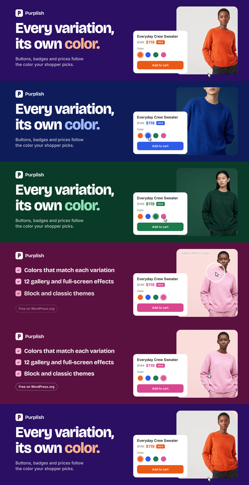
Think of a product page that takes the color of the variation a shopper picks, a gallery that tilts toward the mouse or slides in like a film reel, or a shop page where product cards fan out and hang from a clothes line.
Built to stay out of your way
- Works on the blocks you already use: Purplish adds a panel to 25 WooCommerce blocks, from the Product Gallery to the Checkout, and to 11 core blocks, like Group, Cover and Button. It replaces nothing.
- Each template keeps its own look: your choices are saved on the block in the template, so two templates can look different.
- Off means off: deactivate Purplish and your store looks exactly as WooCommerce draws it.
- Loads only where it’s used: the color script loads on variable products only, and each effect loads only on pages that use it.
- Your photos stay on your server: no outside requests, no tracking and no account to sign up for.
- Quiet admin: no banners, notices or upsells.
What Purplish adds to WooCommerce blocks
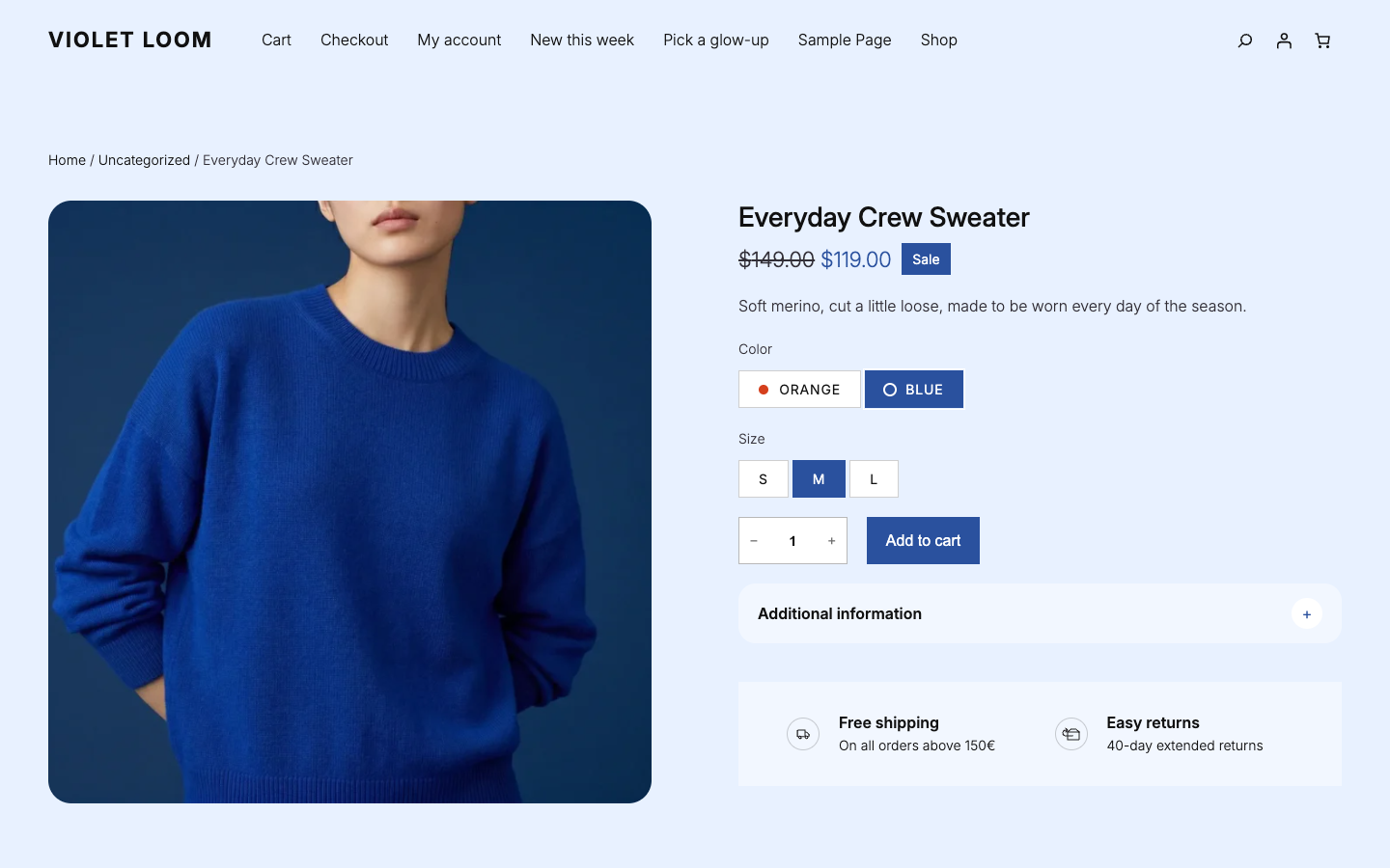
- Product page colors: when a shopper picks a variation, the add to cart button, the selected option and the sale badge take its color, and the sale price and a soft background tint can too. Purplish reads the color from the product in the photo, or you set it by hand. The photo changes with a transition, like Blur, Wipe or Color wash.
- Product gallery: hover styles like 3D tilt, Zoom and Loupe, five full-screen styles, four slide styles, frosted arrows, a photo wash, and rounded or circle thumbnails.
- Product cards: 23 card effects for the Product Collection, add to cart or all the details on the photo, ruled cards with thin lines in place of the gap, an outline add to cart button, a photo wash, a hover look for the card, the photo and the button, and one effect color for all of it.
- Shop page: a choice of which orderings Sort by lists, a grid switch after Sort by, new cards that fade, rise or slide into place after a filter or sort, a Load more button, a product count for a shop hero, and category tabs, chips or category photos with the current one marked.
- Product filters: the filters in one bar of dropdowns above the products, a filter sidebar that hides, chips that match the selected look, a 44px tap size for chips, and color names under swatches.
- Add to cart and buttons: a glow ring, a light sweep, liquid glass, a spectrum ring and googly eyes, plus a halo on each add, a color dot on each color option, a title and price that rise into place, and a quantity box and button at one larger height.
- Mini-Cart: a count that pops, a photo that flies into the cart icon, a drawer that opens with a soft spring, a free shipping meter, and cart items without their short descriptions.
- Cart, checkout and order confirmation: soft rows, bigger photos and a free shipping meter in the cart, checkout fields and choices in your style, button looks on Place Order, a thank-you moment, and the order details on a paper receipt.
- Page sections: soft accordions, reviews as cards or chat bubbles, striped specification tables, pill, circle or price tag sale badges, boxed page numbers, ringed social icons, and a line through options that can’t be bought.
- Scroll and hover: headings that rise or come into focus, sections and columns that come in as they scroll into view, a header that condenses into a floating pill, a seal that turns on hover, Cover scroll and hover looks, and the gallery’s hover styles on any Image block.
Every effect plays on a hover, a scroll, a color change, an add to cart, an opened cart drawer or a placed order, then stops. Nothing moves on its own unless you turn on Showfloor’s autoplay. Visitors who turn on reduced motion on their device get the colors without the animation.
Purplish blocks
Find them in the Purplish group of the block inserter.
- Hanging Rail: the products from a Product Collection hang on a rope and slide along it as the page scrolls, on wooden pegs, binder clips or tape.
- Story Deck: customer stories as a deck of photo cards that visitors drag, swipe or click through.
- Runway: every product photo becomes a look in a line that gets smaller toward the back, with the product cards beside it.
- Scroll Lookbook: a story of Cover shots. As visitors scroll, the camera holds at each shot and brings in that product’s card.
- Showfloor: shop the look on a turning oval floor of looks, with a numbered marker on each piece and one button that adds the whole look to the cart.
- Changing Room: tops and bottoms turn in two rings around a photo of a model. Visitors dress the model and add the outfit to the cart.
- Wardrobe: a mega menu item for the Navigation block that opens a big panel of category links, photo tiles and a look for each link.
- Shelf Tag: a best seller, new arrival or featured tag on the product photo, as a chip, a pill or frosted glass.
- Color Dots: the colors a product comes in, as dots or swatches on its card. Tap or point at one to see that color’s photo.
- Escalator: photos or products ride two or three columns that move in opposite directions, with a hover look and an add to cart button for each tile, for a store home page hero.
Patterns
Purplish’s 23 patterns are in the Purplish category of the pattern inserter. They’re built from WooCommerce and core blocks, so you can change any part.
- Store front: Flagship home is a full front page with a Showfloor, category tiles, best sellers, a brand band, the newest products, customer stories, a trust row and a newsletter sign-up. Each of those sections is also its own pattern.
- Header and footer: Flagship header has a Wardrobe Shop menu and a bag pill that condenses on scroll, with Flagship phone menu for small screens. Flagship footer ends on the site name as a big wordmark that rises from the floor.
- Shop pages: Flagship shop is big and photo-led, Atelier shop is quiet with accordion filters, and Boutique shop is dense with a filter sidebar and color swatches.
- Heroes: Escalator hero with products and Escalator hero with photos.
- Product showcases: Hanging rail of new arrivals, Customer stories deck, Runway lookbook and Scroll lookbook storefront.
- Cart and checkout: Empty cart with category tiles and best sellers, Checkout header with Bag, Checkout and Done steps, and a Money-back guarantee card.
Abilities for AI agents
Purplish registers four abilities with the WordPress Abilities API. Through the REST API or the MCP Adapter plugin, an AI agent can list what Purplish can do, read the options a page uses, set them on a block and add a pattern. Only Purplish’s own options change, and each change saves a revision.
Block and classic themes
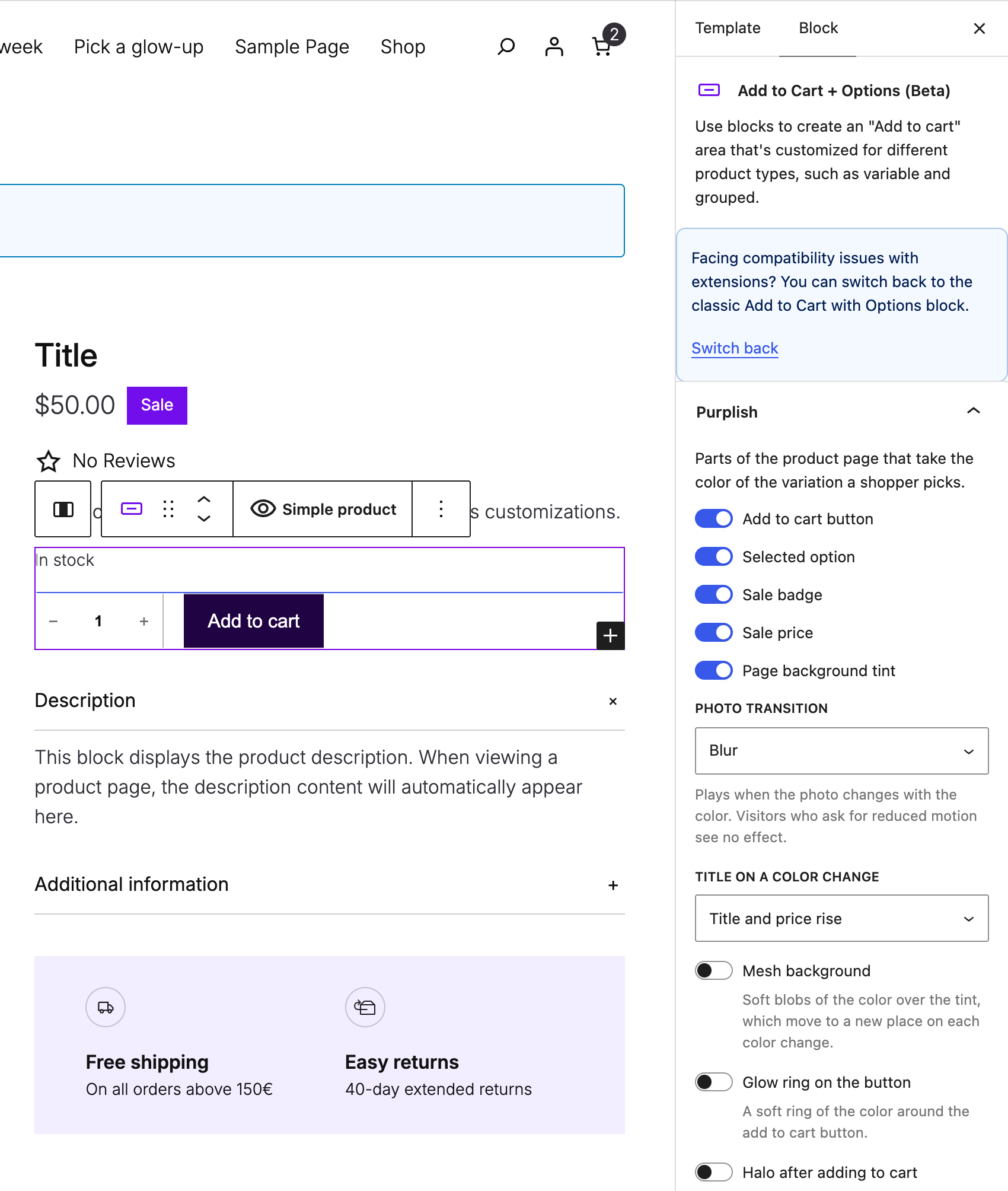
Purplish is built for block themes and tested with the free Purple theme. On a block theme, every option sits in a Purplish panel on the block it changes, in the Site Editor.
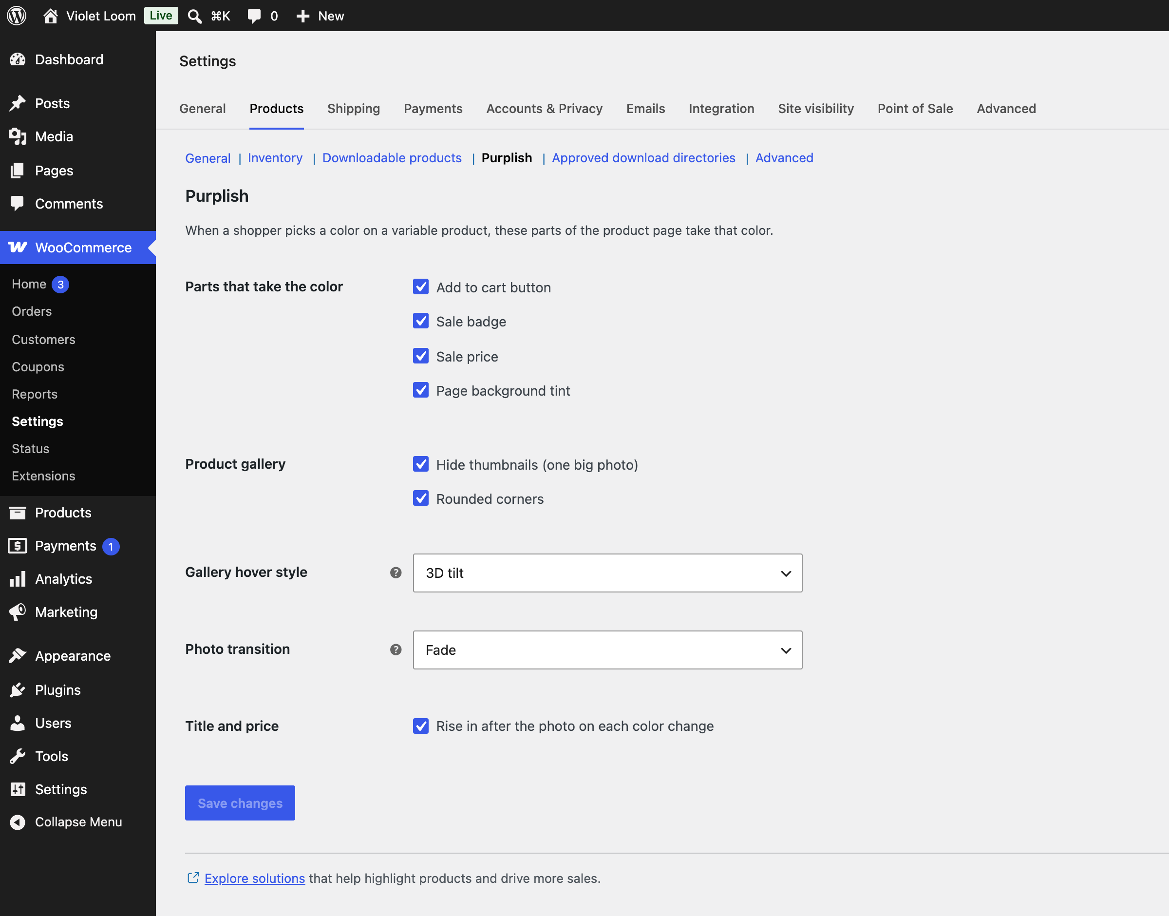
Classic themes get a smaller set under WooCommerce > Settings > Products > Purplish: the page colors (except the selected option, since classic themes show a dropdown), the photo transition, the title and price rise, and three gallery options: hide thumbnails, rounded corners and the hover style.
Why I made it
Purplish started with one small idea from a discussion on X: let the product page take the color of the variation a shopper picks. Building it showed me how much more WooCommerce’s blocks can do with a few good options, so I kept going. I built the Purplish plugin site with WooCommerce, the Purple theme and Purplish itself.
Shameem Reza
Source code
The code is on GitHub, with every option explained in the README. The readable source of the scripts ships in assets/src, next to the built files in build. To build them, run npm ci and npm run build.
Privacy
Purplish doesn’t collect, store or send personal data. It sets no cookies and makes no outside requests.
Credits
Thanks to Luigi Teschio for the idea, from a discussion on X: set each variation’s color by hand, or read it from the photo.
Installation
- Make sure WooCommerce 11.0 or later is active.
- Go to Plugins > Add New, search for Purplish, then install and activate it. Purplish reads the colors of your variation photos in the background.
- To change a variation’s color, edit the product, open Variations and use the Page color field. For a simple product, it’s on the General tab.
- On a block theme, open a template in the Site Editor, select a block Purplish works on, like Add to Cart + Options, Product Gallery or Product Collection, and open the Purplish panel. Purplish’s own blocks are in the Purplish group of the block inserter. On a classic theme, go to WooCommerce > Settings > Products > Purplish.
FAQ
How do I change the add to cart button color for each variation in WooCommerce?
Install Purplish. Each variation takes its color from its photo by default, and the add to cart button follows the variation the shopper picks. To set a color yourself, edit the variation and set Page color to Custom.
Does Purplish work with my theme?
Yes. Block themes get every option through WooCommerce’s product blocks. Classic themes get the page colors, the photo transition, the title and price rise, and three gallery options.
A block theme can match Purplish’s corners, shadow, photo wash and ruled lines to its own in theme.json, under settings.custom.purplish (radius, shadow, wash and rule). The README on GitHub has an example.
Does it work with simple products?
Yes. A simple product gets one Page color for its whole page, read from its photo or set by hand.
Do I need color swatches?
No. Purplish works with WooCommerce’s plain dropdowns and option buttons. If you set swatch colors on the color attribute, Purplish uses those first. To show a dot of each color on the option buttons, turn on Color dots.
How do I add a hover effect to the WooCommerce product gallery?
On a block theme, open the Single Product template in the Site Editor, select the Product Gallery block, and pick a Hover style in the Purplish panel. The full-screen and slide styles are in the same panel. On a classic theme, pick the hover style under WooCommerce > Settings > Products > Purplish.
Can I change how product cards look on the shop page?
Yes, on block themes. Select the Product Collection block on your shop or collection template and open the Purplish panel. You can put add to cart on the photo, pick one of 23 card effects, and add a hover look to the card, the photo or the add to cart button.
A color Purplish found looks wrong. What do I do?
Set the variation’s Page color to Custom and pick the color. A busy photo, like a model in a furnished room, can point Purplish at the wrong area.
Why do some option buttons have no color dot?
An option gets a dot only when every variation with it has the same color. A size, or an option that comes in several colors, has no single color to show. On the picked option, the dot turns the button’s text color so it stays visible.
How does Purplish pick a variation’s color?
Each variation has a Page color setting. Automatic, the default, finds the product in the photo, not the wall behind it, and takes its color. If the color attribute has a swatch color, that comes first. Custom uses the color you pick, exactly as you set it. Off keeps your theme’s colors. A photo’s color is often too dark or too pale for a button, so Purplish keeps the hue and adjusts it for each use, with readable text on the button. The page opens in the default variation’s color, so there’s no flash of your theme’s colors first.
Which photo transitions are there?
When the color changes, the photo changes with Blur (the default), Fade, Zoom, Slide, Flip, Wipe, Circle reveal, Color wash or None.
Which gallery styles are there?
Hover styles: 3D tilt, Zoom, Loupe, Lift, Parallax, Glare and Slow zoom. Any of them replaces WooCommerce’s own hover zoom, and touch screens skip it. Full-screen styles, for the lightbox that opens when a shopper clicks the photo: Snap stack, Zoom from photo, Filmstrip, Cinema and Classic fade. They need the gallery’s “Open pop-up when clicked” setting. Slide styles: 3D media gallery, Circular slider, Reel slider and Image tunnel.
Which card effects are there?
There are 23. On hover: Spotlight, Color reveal, Fan deck, Expanded cards, Magnetic panel, Card folder, Bookmark and Roster. In a carousel (a grid stays as it is): Deck, Arc, Spotlight carousel, Grow, Tilt, Depth, Overlap, Momentum, Wheel, Helix and Reel, and the last three can also be dragged with the mouse. As cards scroll into view: Clothes line, Parallax, Zoom reveal and Unfold, which needs the Grid layout.
How do I show a best seller tag on WooCommerce product cards?
Put the Shelf Tag block inside the Product Image block of your Product Collection and pick its rule: best sellers, new arrivals or featured products. The tag shows only on the cards it matches, as a chip, a pill or frosted glass, in the corner you pick, with your own words if you like and a shine on hover.
How do I show a sold out label on product cards?
Put WooCommerce’s Stock Indicator block inside the Product Image block and turn on Only when sold out in the Purplish panel. It takes the same three looks as the Shelf Tag and can grey out the photo.
How do I show color swatches on WooCommerce product cards?
Add the Color Dots block to the card. It shows the colors a product comes in, as small dots beside the name or swatches under the price, from your color attribute or each variation’s page color. Shoppers can tap or point at a dot to see that color’s photo on the card, with a fade, wipe or slide. It works from the keyboard, and the photo’s alt text names the color for screen readers.
How do I make a WooCommerce category grid with images?
Select the Terms Query block and set its Look to Category photos. Each category shows its photo in a circle, rounded square, square or arch, with a ring around the current one, and you can add a hover and a scroll entrance. For big tiles, add the Shop by category pattern: your four biggest categories, each with its photo and a Shop now button.
Can I add a mega menu to a block theme?
Yes. Add the Wardrobe block to your Navigation block. Hovering or clicking its label opens a big panel under the header, made of blocks you edit in place. With more than one look card in the panel, hovering a category link shows its look. Enter or Space opens it, Escape closes it and puts focus back on the label, and on phones the label is a plain link.
How do I add a Load more button to the WooCommerce shop page?
Select the Pagination block in your Product Collection and pick Load more in the Purplish panel. The button adds the next page under the products, on its own or over a fade, and the new cards come in one after another. It takes the Button block’s looks, and a reload or the Back button keeps the same products.
Can the product filters sit in a bar above the products?
Yes. Select the Product Filters block and set Layout to Bar. Each filter opens as a dropdown under its label, on a click or on hover, with four open styles. To keep the sidebar instead, turn on Sidebar can hide for a Hide filters button beside Sort by. Phones keep the filter overlay either way.
How do I style the WooCommerce checkout?
Select the Checkout block and open the Purplish panel. Fields can be soft, filled or underlined, with a focus ring in the effect color. Shipping and payment choices can sit on cards, step numbers can be badges or a timeline, and the order summary can sit on a soft card with a bigger total. Place Order gets the Button block’s looks and a small lock. Nothing on the checkout moves.
Can I change the cart drawer and the order confirmation page?
Yes. The Mini-Cart drawer can open with a soft spring, with the items on soft rows, and Fly to cart sends the product photo into the cart icon. On the order confirmation page, the Order Status heading can rise with a burst of rays behind it once, and the Order Summary can sit on a paper receipt with a torn bottom edge, printed on the block’s background color. The drawer and the Cart page can show how much more the cart needs for free shipping. Both can also hide each item’s short description, so the rows stay short.
Can shoppers add a whole outfit to the cart at once?
Yes, with two blocks. On a Showfloor, one button adds every piece of a look at the price shown, and variable products link to their page instead. In the Changing Room, Add both adds the top and the bottom and asks for a size first when a piece needs one.
Does anything move on its own?
Only Showfloor’s autoplay, and it’s off by default. When you turn it on, it moves every 3 to 8 seconds, holds while a visitor uses the floor, and has a pause button. The Scroll Lookbook’s opening video plays once and stops within 5 seconds. Visitors who turn on reduced motion get neither.
Can I turn it off for one variation or product?
Yes. Set its Page color to Off, and it keeps your theme’s colors.
What about visitors who turn off motion?
Visitors who turn on reduced motion on their device get the colors without any animation.
Will Purplish slow down my store?
No. Photos are read in the background and the color is saved with the product. The product page loads a small stylesheet. The color script loads only on variable products, and each effect loads only on pages that use it.
Do my product photos leave my site?
No. Purplish reads the photos on your own server, with the image tools PHP already has, and never sends them anywhere.
Does it change WooCommerce’s blocks or templates?
No. Purplish adds a panel to WooCommerce’s own blocks and styles the parts you choose. Deactivate it, and your store looks exactly as it did before.
Can an AI agent design my store with Purplish?
Yes. Purplish registers four abilities in the Abilities API: get the design catalog, get the designs on a page, set a block’s design and insert a pattern. Add the MCP Adapter plugin to offer them to an agent. Running them needs the same permission as editing that page or template in WordPress.
Where do I report a security issue?
Please report it privately through the security policy on GitHub, not in the support forum.
Screenshots


Changelog
1.3.3
- New: The free shipping meter names your Free shipping method, takes your own wording, and can sit at the top of the Cart’s totals column.
- New: Ruled cards can take their own column count on tablets, with the lines counted for it, and a Closing rule keeps the line under the last row.
- New: A theme can set the photo wash and the ruled cards’ line colors in theme.json, under
settings.custom.purplish. - Fix: The outline add to cart button on product cards keeps its edge and full width when WooCommerce’s button styles load after Purplish’s.
1.3.2
- New: Escalator, a block of photo or product tiles that drift past in opposite columns, with a pause button, a hover look and an add to cart button on each tile. Two hero patterns use it.
- New: Product Collection can rule its cards with thin lines in place of the gap, wash its photos in the effect color, fill the add to cart button when a shopper points at the card, and use an outline button that fills on hover. The Product Gallery gets the photo wash too.
- New: Three Ring settings for product cards: inside the card, square corners, and full color on hover.
- New: The Mini-Cart drawer and the Cart page can show how much more the cart needs for free shipping, and hide each item’s short description.
- New: Chip tabs for Terms Query that can wrap onto more rows, and an order receipt printed on the block’s background color.
- New: Catalog Sorting can choose which orderings to list, leave out average rating until a product has a rating, and use a larger 44px select.
- New: A 44px tap size for Product Filters chips and the phone filters button, and a larger buy row for Add to Cart with Options.
- New: A theme can set Purplish’s corners and shadow once in theme.json, under
settings.custom.purplish. - Fix: The second photo shows again on product cards with WooCommerce 11.3.
- Fix: The main photo stays hidden under the second photo on hover.
- Fix: The Glow ring works on products without a page color. It uses the theme’s button color.
1.3.1
- Fix: On phones, the Atelier and Boutique shop filters now open above a sticky or fixed theme header, so the close button and the first filter can be tapped again. Pages built from the 1.3.0 patterns get the fix too.